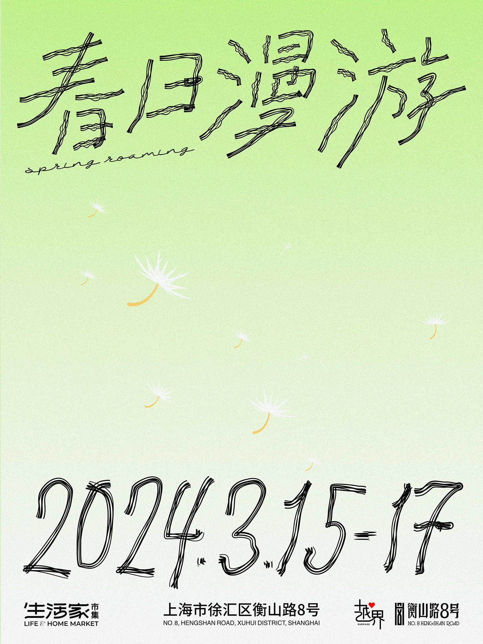
简洁的春日市集海报设计。我在大部分设计过程中,都会带着「这个元素有用吗」在思考,没用的就删掉。什么是春天?已经不需要过多去讲解给观众。在设计过程中做减法不失为最佳的办法,一点舒服的绿色、灵动的蒲公英、散漫的手写字体,都在辅助表现「春日漫游」的主题。
Simple spring bazaar poster design. In most designs, I think about “Is this element useful?” and delete the useless ones. What is spring? No need to explain much to the audience. Subtraction in design is a good way. Some comfortable green, vivid dandelions and casual handwritten fonts help express the theme of “roaming in spring”.

