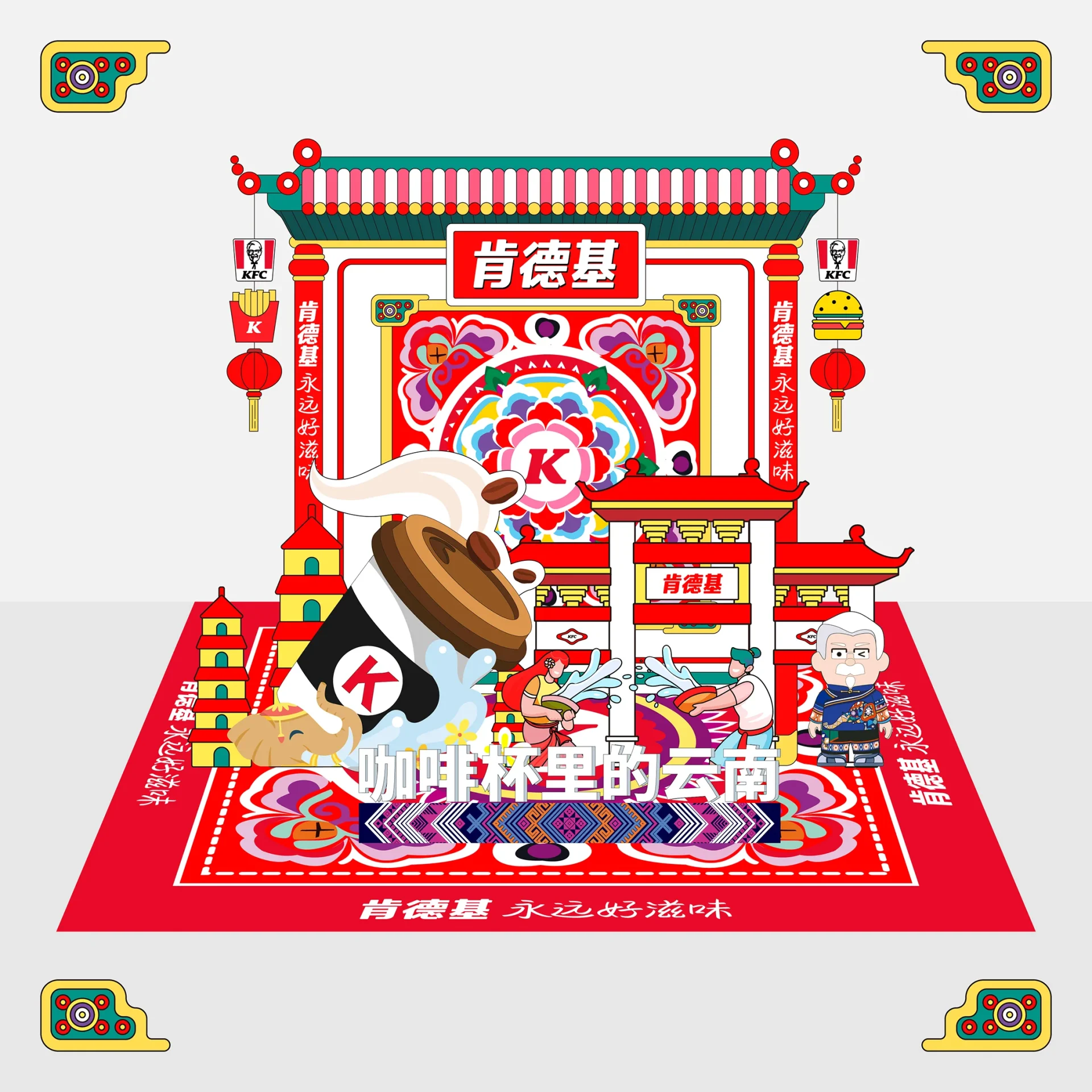
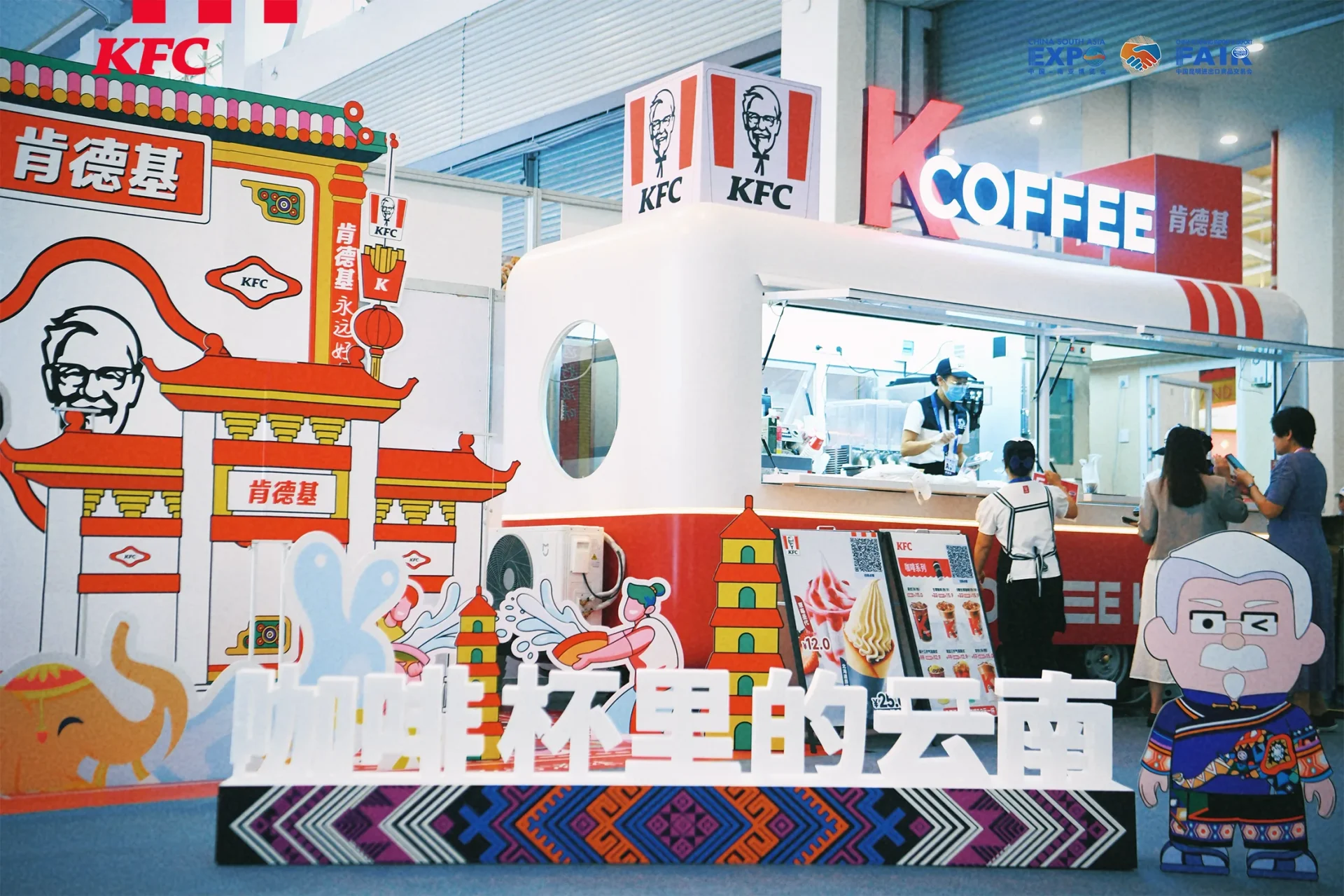
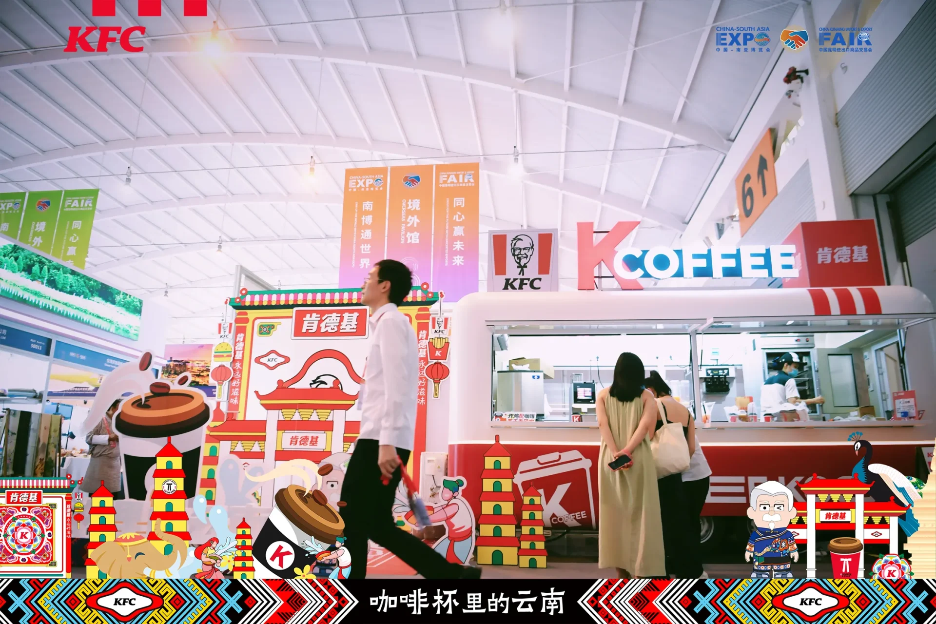
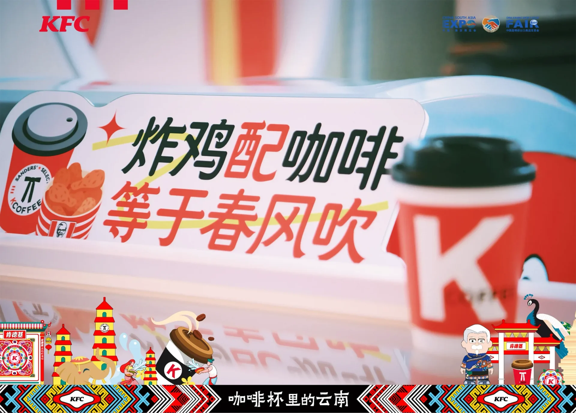
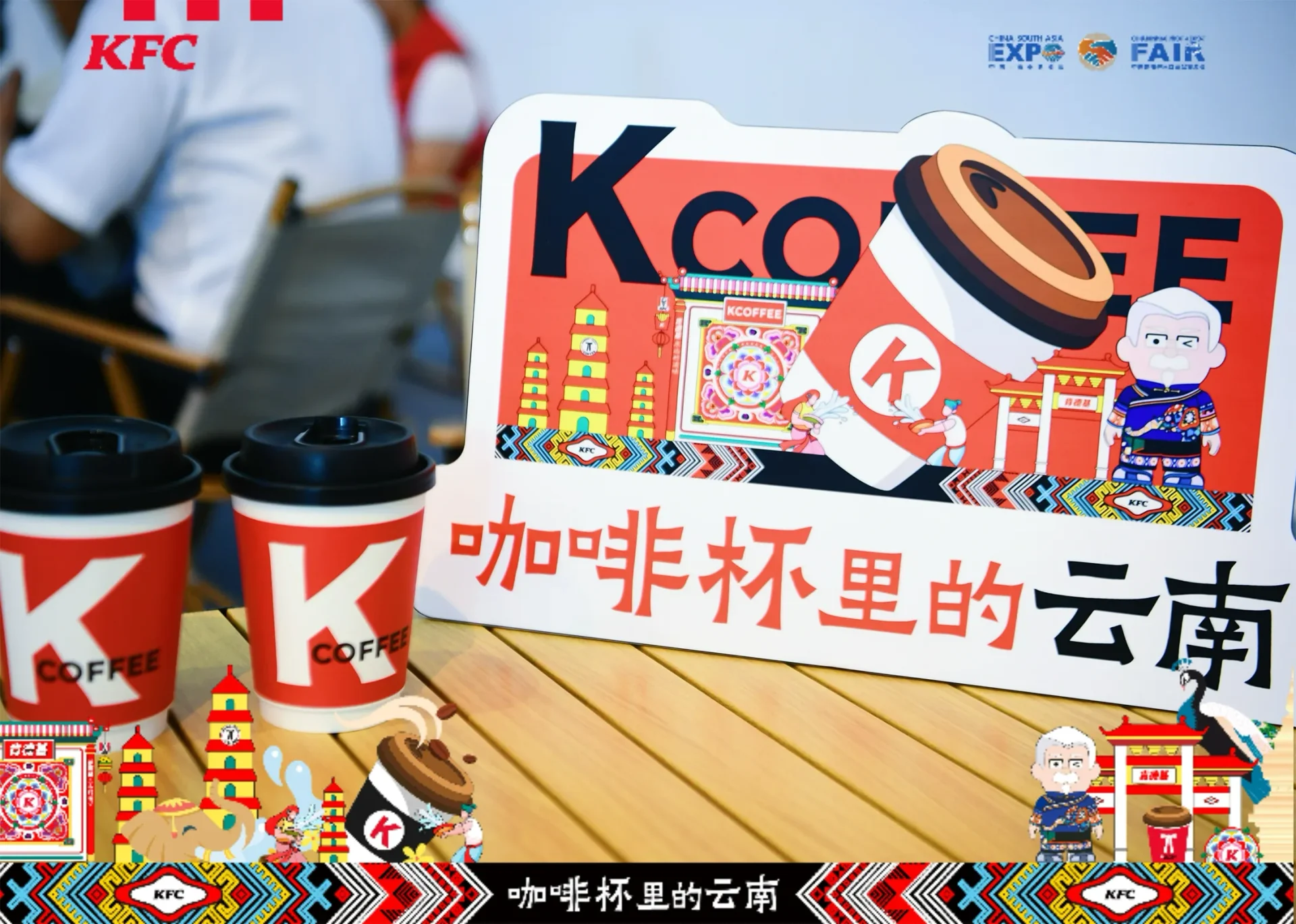
肯德基 KFC、肯悦咖啡 KCOFFEE@第八届南博会“#咖啡杯里的云南”展位设计。大象、孔雀,咖啡豆,纹样、照壁,塔与坊,都不具体,但都云南,远看似云南,细赏是云南。逛南博喝KCOFFEE,打卡最Cute民族风。
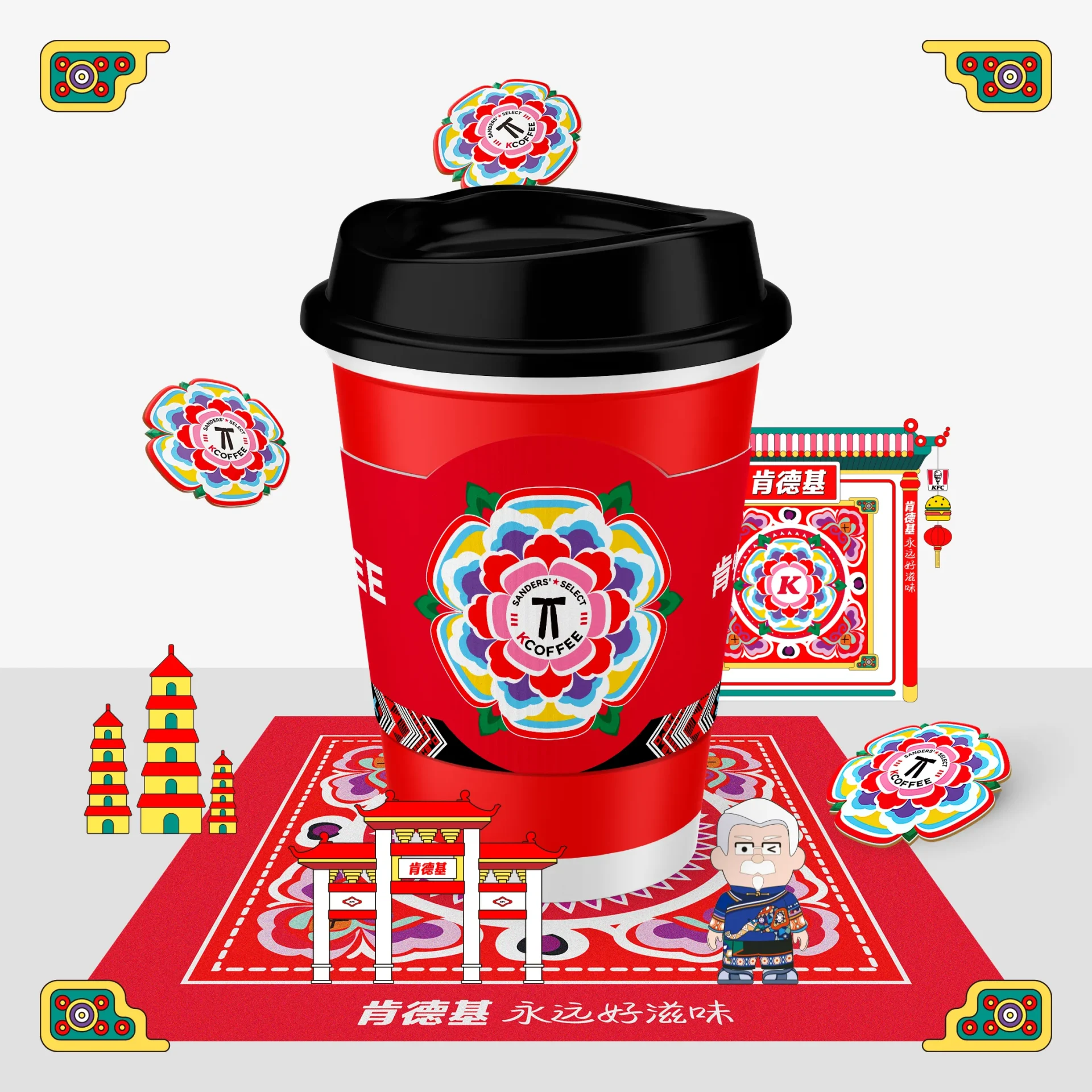
肯德基与肯悦咖啡齐齐亮相第八届南博会,美陈、周边、包装所用的插画风格并未采用泛滥的“国风”来表现云南传统主题。“似云南、是云南”的手法,轻松活泼的形态与颜色可以在南博会这类严肃场景中轻易出众,也能吸引更多年轻的新的客群注意力。所有元素均易于延展成为周边产品。在创作过程中,取用了肯德基品牌色红色来创作民居照壁、傣族泼水节、云南多地可见的塔和坊(没有写实但能让人识别出云南特征),并将品牌元素恰当的植入进民族纹样之中,大象、孔雀、鲜花、身着云南特色服饰的肯德基上校爷爷有趣的结合为“似云南、是云南”的场景中。除了建筑的画风,民族元素也同样并没有去表现具体的民族。
KFC and Kenyue Coffee showed up at the 8th South China Expo. The illustration style for displays, peripherals and packaging didn’t use the common “traditional Chinese style” for Yunnan themes. The approach of “like Yunnan, is Yunnan”, with its lively forms and colors, stands out at the expo and attracts young customers. All elements can be made into peripherals. In creation, KFC’s red was used for Yunnan features like screen walls, Water Splashing Festival, towers and arches. Brand elements were put in ethnic patterns. Elephants, peacocks, flowers and Colonel Sanders in ethnic costumes combine in a “like Yunnan, is Yunnan” scene. Ethnic elements didn’t represent specific ethnic groups.

